|
|
 |
|
Home »
Flower Facts »
Basics of Design

Basics of Design
Seven steps from the floral experts for making vase arrangements.
Along with other flower retailers, many professional florists are catering to customers who want to make their own bouquets with large, unrefrigerated displays of high quality cut flowers and greens, grouped by color and variety.
In floristry, floral design is the art of creating a subtle and delicate harmony between the container (such as a vase), the content (flowers) and the surrounding environment (such as a room) to create an ambiance or a mood.
- Choose flowers like fresh produce. Look for blooms that are just starting to open, have firm stems, healthy leaves and erect, vibrant petals.
- Three types of flowers: mass (focal), filler and line as the basis of floral design. Mass flowers are generally round and full-faced (e.g. roses, gerberas, tulips, lilies) and form the focal point of color or interest in the bouquet. Filler flowers or greenery refers to foliage that rounds out your bouquet and gives it a soft, full look (e.g. greens, babys breath, heather, statice, solidaster). Line additions (e.g. branches, tall foliage, gladiolus, liatris, snapdragon) give your bouquet its shape by adding height, width, and a balanced look.
- Get the vase ready. The possibilities are endless but avoid plain metal containers (those without a protective plastic coating). Make sure the vase is clean, leak-proof, with a neck and water reservoir large enough for your flowers to fit comfortably. The height of your vase should be about half as tall as your flowers. Add fresh, warm water until ¾s full and the contents of a flower food sachet, according to the instructions.
- Sort and clean your flowers and greens. Group your purchases according to mass, filler, and line. Remove all stem leaves that will be below the water line. Trim stem ends diagonally with a sharp knife of shears, to about twice the height of the vase, leaving line stems a few inches longer.
- Insert filler foliage and flowers. Criss-cross line stems as you add them to the vase to create a grid that holds the flowers in place.
- Space mass flowers evenly throughout filler. Start at the rim of the vase and work towards the centre.
- Finally, add line stems. Place the longest stems in the centre and work out towards the sides. Stand back and review your bouquet, making adjustments as necessary.
Design in Floristry
In floristry, design determines the way we choose and sue our materials: the way every piece of floristry is planned and organized to give the maximum visual appeal.
The elements of design guide us in creating visually attractive work. However, such guidelines are not rigid. They allow freedom and flexibility to express ones own style. It is important to understand the elements of design which are: Color
Whilst line is the basic component of design, color provides emotion. Countless books have been written on color, yet few people understand its full emotional impact. A color that inspires and cheers one person can irritate another. Colors can be warm or cold, sending out cheerful or soothing vibrations.
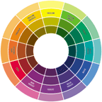
The color wheel is a graphic tool for understanding the relationship colors have to each other. Essentially, a color wheel takes the colors of the spectrum and presents them in a circle to express color harmonies. A 12-hue color wheel is standard in the floral industry. Artists use 24-hue wheels for greater color understanding.
The color wheel used by artists has several color groups but the three most basic ones are:
Primary colors - Red. Blue and yellow are the sources of all colors. Primary colors cannot be created by mixing colors.
Secondary colors Green, orange and violet are created when two primary colors that are next to each other on the color wheel are mixed in equal proportions.
Intermediate colors - Are obtained by mixing equal parts of a primary color and a secondary color that lies next to it. There are 6 intermediate colors in the 12-Hue Color Wheel.
Color has three dimensions: hue, value and chroma. - Hue is the name of a particular color, thus hue is not synonymous with color as there can be several hues of the same color.
- Chroma is the colors intensity and is also called saturation
- Value is a colors lightness or darkness.
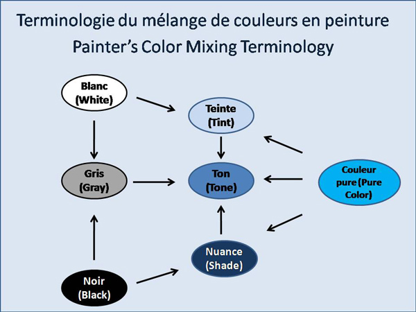
Tints, Tones and Shades
Tints, shades and tones all affect a colors value: - Tints are created when white is added to a color.
- Shades occur when black is added to a color.
- Tones are colors with grey added.
Given a color or a hue, by mixing it with white, gray or black, will give a different tint, tone or shade.
These terms are often used inappropriately but they describe fairly simple color concepts. The important thing to remember is how the color varies from its original hue. If white is added to a color, the lighter version is called a "tint". If the color is made darker by adding black, the result is called a "shade". And if gray is added, each gradation gives you a different "tone."
Tint = hue + white
Tone = hue + gray
Shade = hue + black
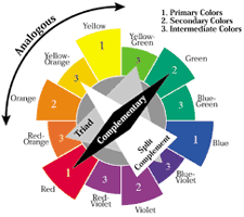
Color Harmonies
Color harmonies or color schemes are how colors are used together in an arrangement. There are 5 fundamental color harmonies - Monochromatic
- Analogous
- Complementary
- Split complementary
- Triad
Complementary colors
Complementary colors are colors opposite each other on the color wheel, like blue and orange, violet and yellow, red and green. They are warm and cool colors. The complementary color harmony is the brightest color harmony there is because its colors are opposing. They give you the greatest contrast. Contrast can also be heightened by the intensity of the colors you choose.
Designing with complementary colors creates greater impact with few flowers. Complementary arrangements look wonderful in large rooms like banquet halls or lobbies but tend to overpower smaller areas.
Colors are frequently described as advancing or receding. Active colors will appear to advance when placed against passive hues. Passive colors appear to recede when positioned against active hues, Advancing colors are warm colors like reds, yellows, oranges, red-violet and yellow-green. Receding colors are cool hues like blues, greens, blue-violet and violets.
Many florists think the most important thing about color and design is knowing the receding and advancing colors and how they affect people. You should know how people are emotionally affected by color. Warm (advancing) colors and cool (receding) colors have an automatic emotional impact. People generally have a preference for either warm or cool colors. Preference also depends on mood and what people need. You can choose warm colors if you want to cheer people up or cool colors if you want a formal or soothing feeling.
Analogous colors
Analogous colors are made up of adjoining colors consisting of one primary, one secondary and two intermediate colors.
When you choose analogous colors, it is best to pick those that fall either on the cool side of the harmony or the warm side, because an analogous harmony generally has an emotional feel to it. The easiest way to remember analogous harmonies is to think of the harmonies of nature, like the red-violets and violets in a sunset. Or think of autumn with its yellows, oranges and browns or the harmony of forest greens, blue lakes and the blue sky.
Adjacent colors reinforce each other and create a close harmony. When these colors are used in groups, they create analogous colors schemes.
Monochromatic colors
A monochromatic arrangement is an arrangement with tints, tones and shades of a single hue. For example, sky blue to medium blue to navy blue and all shades and tints in between is monochromatic color scheme. When used in a floral arrangement, this scheme has a retreating, subdued character.
Color summary
To sum up, here is a list of some of the important elements of color.
Primary colors Red, blue and yellow.
Secondary colors Orange, green and violet. Created by mixing two primary colors.
Intermediate colors Red-orange, blue-violet, red-violet, blue-green, yellow-orange and yellow-green, created by mixing primary color with either secondary color located next to it on the color wheel.
Warm colors Reds, red-violet, oranges, yellow and yellow-green. These are also called advancing colors.
Cool colors Blues, greens, blue-violet and violet. Also know as receding colors.
Neutral colors White, black and grey.
Tones A variation or a graduation of a color, achieved by adding grey.
Chroma A colors intensity; its brightness or dullness.
Value A colors lightness or darkness. Affected by tints, tones or shades.
Complementary colors Colors opposite each other on the color wheel.
Analogous colors Colors opposite each other on the color wheel.
Triad A combination of any three colors equally distant from one another on the color wheel.
Polychromatic colors A combination of five or more colors on the color wheel.
Monochromatic colors A range of tints and shades based on a single-color.
Form
Use of a variety of shapes within a design as the contrast between them provides interest. Line material is generally used to give height and break up solid, round shapes. Their spiky shapes give movement to a design: gladioli, larkspur and bulrushes are typical examples.
Round materials attract the eye and are generally used for focal flowers. Round shapes, used at the base of a design, stabilize it. Gerberas, roses and carnations, are several examples.
Transitional materials are used as stepping stones to link round and line materials together. Spray carnations and spray chrysanthemums are often used for this purpose.
Space
The use of maximum space within a design will both define and enhance the material being used. Designs with flowers tightly packed together, allowing no space between them, will result in a solid, static appearance.
Texture
Visual textures, in any good design, should be varied. This is particularly true when creating a design which is all in one color. For example, an all-white arrangement could look bland without the added interest given by differing textures.
Principles of design
To create visually attractive floristry it is important to understand the following principles of design: - Balance
- Proportion
- Rhythm
- Contrast
- Dominance
- Harmony
Balance
There are two types of balance: actual and visual. In design we are concerned with visual balance. An arrangement can look unbalanced without actually falling over. To achieve a good visual balance, the materials must be used and positioned with care. It is not always necessary to use two items of equal size to achieve visual balance. A single, large flower can be balanced by a group of smaller ones. A large, shiny leaf, used low down in a design, looks visually heavy and can balance a group of very tall flowers.
Proportion
Proportion is the relationship of the parts of the design, the arrangement to its container and the whole composition to its setting. Good proportion is dependent on many things: - The visual weight of the chosen flowers and foliage. An example of poor proportion would be very large flowers in a small container.
- The visual width of the container.
- The setting of the design. The style and size of the design and its container will be determined by its location.
All three factors will determine the height and width of the finished design. There are no absolute rules on proportion.
Scale
Scale concerns the sizes of the individual items within the design. Too great a difference in size between the flowers will lead to an uncomfortable looking design. For example, a large chrysanthemum bloom and a small freesia are two extremes of size. Transitional material, such as spray chrysanthemums may be required to link the two together. To produce a harmonious design, grading the sizes of the materials within the arrangement is essential.
Rhythm
Rhythm is an expression of movement, a necessary component in a design to draw the eye from one part of the design to the next. A design which lacks rhythm is static and boring. There are many ways of creating rhythmic appeal: - Grouping flowers through the design gives a sense of movement and continuity.
- Curved lines create greater movement than straight ones.
- Recession, achieved by placing some flowers at lower levels than others, is also important.
Contrast
Contrast is achieved by using a variety of colors, shapes and textures, which are all important elements in a design if monotony is to be avoided. Carefully planning and using the Elements of Design will give the variety necessary in a perfect design.
Dominance
Dominance in a design lies in emphasizing one, or more, areas of the design above the others. Generally in floristry, dominant areas are called focal points. There can be more than one focal point in a design.
Large, round shapes, bold colors and shiny textures can be used to create areas of greater dominance within a design.
Harmony
When combinations of all the Principles and Elements of design have been well used, harmony will result. It is the final achievement and there will be total agreement between all parts of the design.
Decorating with Flowers
Here are some simple ways you can use flowers to brighten your home or office.
Entranceway/Foyer - Attach small vases containing short stems of fresh flowers to a pre-made wreath and hang it on your front door to welcome guests.
- Make a first impression with a large, abundant arrangement.
- Create a focal point with a piece of artwork on a pedestal draped with a garland and flowers.
- For a friendly look, place a basket with a garden bouquet on the entry table.
Dining Room
For an easy, elegant table decoration set a series of alternating crystal vases and candles on a fabric runner. Place fresh flowers in each of the vases and surround them with greenery. - Individual flowers are perfect at place settings or attached to name cards.
- Blending with the casual atmosphere of modern home entertaining, a centerpiece is sure to dazzle guests during afternoon brunch or informal dinners. Candles provide a refreshing combination using the elegance of flowers with the ambience of candlelight.
Living Room - Take your favorite vase, treasured antique bowl or silver pitcher to your florist for a custom-designed arrangement.
- Float two or three blooms, such as gardenias or gerbera daisies in a favorite crystal bowl. Add a floating candle or two for a glowing evening effect.
Family Room - In the summer when the fireplace isn't being used, brighten the hearth with an abundant assortment of seasonal flowers. Continue the theme by placing a few of the same flowers on the mantle next to those family photos.
Kitchen - Trim a windowsill with a collection of terra cotta pots, using a combination of herbs and sun-loving plants like kalanchoe, African violets or primroses.
- Old water pitchers, antique teapots, classic urns or even tattered clay pots make fascinating containers for a casually placed flower arrangement.
Loosely clustered to give the look of a freshly cut garden bouquet, a hand-tied design adorns a favorite water pitcher would be a beautiful addition in your kitchen. The complementary flowers and colors brighten any part of the house, from the kitchen to the family room to the bedroom.
Bedroom - Tea roses, freesias, peonies, lilac and lilies, are all deliciously fragrant choices for a bud vase on your nightstand.
Guest Bedroom - A bud vase with a simple cluster of flowers hidden in the center of a clear bubble bowl filled with potpourri is the perfect way to welcome a guest.
- Try floating rose petals in a special bath to spoil a friend!
Home Office - Give yourself a "nature break" by keeping a flowering or green plant next to your computer station or fax machine.
|
|
|